Writing
Turning the Lunch Pail Labs website into a workbench
A weekend redesign of the Lunch Pail Labs website to include tools, music, books, and a CRT.
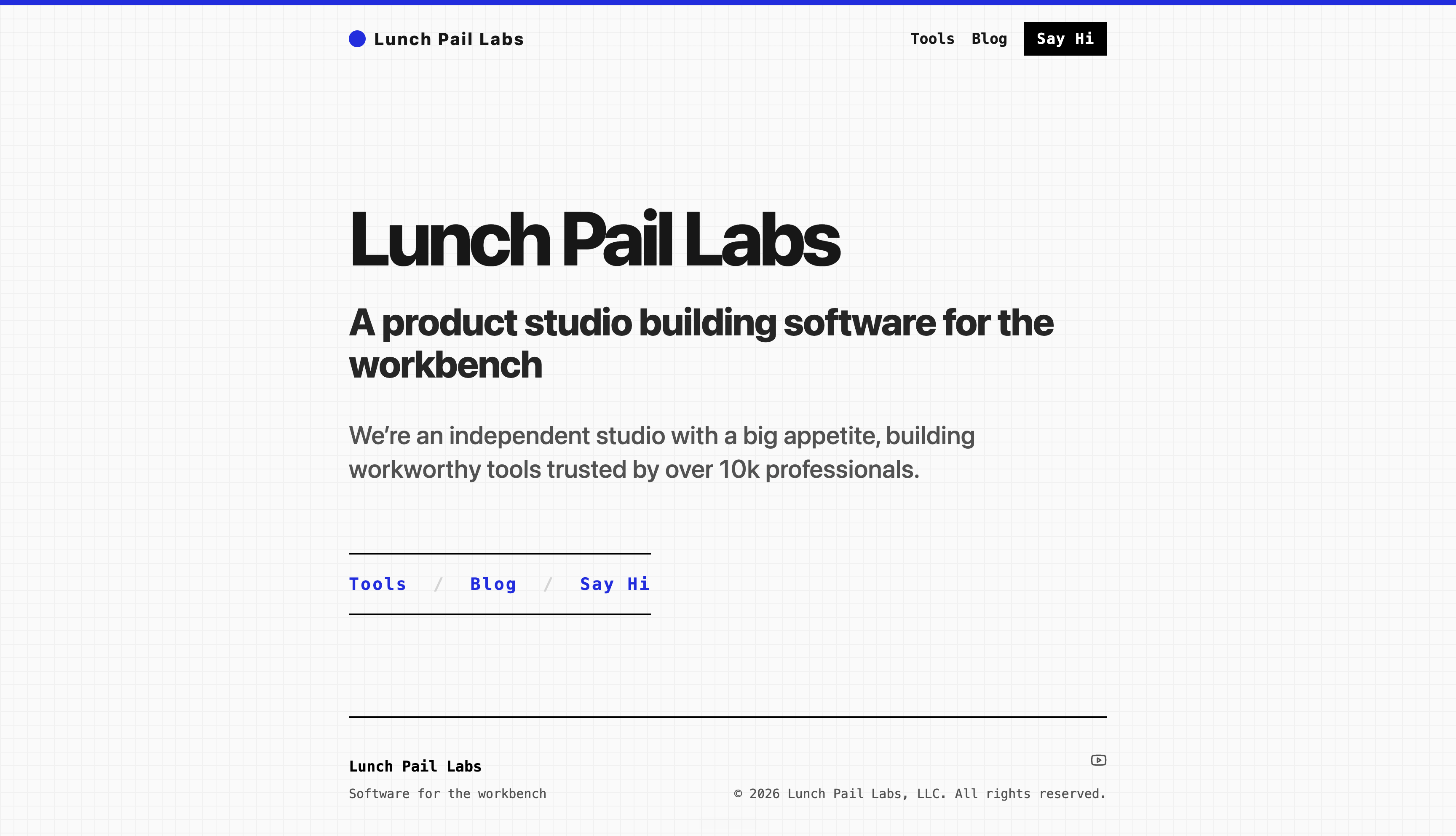
The old Lunch Pail Labs website was doing the minimum acceptable job.
That sounds harsher than I mean it. I have never treated lunchpaillabs.com as an important surface in the business. It is not directly a revenue driver. People usually meet Lunch Pail through one of its arms: a YouTube video, an article, a marketplace integration, a tool, or a project already in motion.
Lunch Pail Labs is the container for all of those activities. Because of that, I have usually kept the site simple. It needed to explain roughly what Lunch Pail was, not carry the whole business.
Over the weekend, I gave it more attention than I had in months.
Partly because building with AI has made these experiments feel trivial enough to attempt. But mostly because I have been having too much fun pushing Codex and OpenCode to build things with more taste. I wrote more about that in how to give agents design taste.
So the weekend project became a small experiment: could I make Lunch Pail Labs express more of the world it lives in?
Here’s how that went.
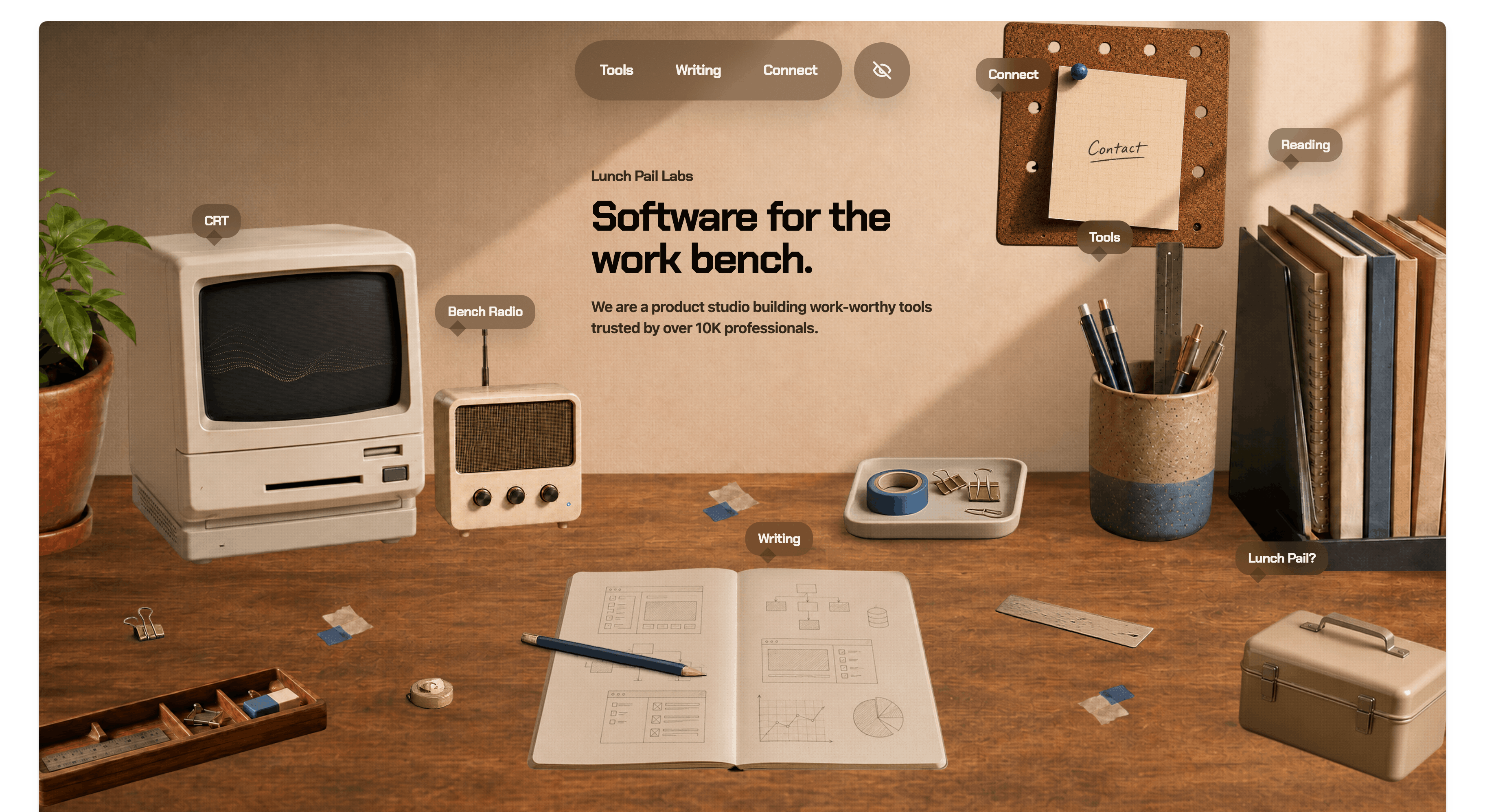
Software for the workbench
Lunch Pail Labs has taken a few shapes.
Last year, the site was saying something like, Focus on your business, we’ll handle integrations. That was true enough for the services and integrations season of the studio, but it started to feel too narrow. It made Lunch Pail sound like an implementation shop, when the work was drifting toward something else.
The studio was becoming more of a portfolio of tools.
That is where software for the workbench came from.
The phrase felt closer to the instinct behind Lunch Pail. I like making things that make my own work easier. I like software that feels like something you reach for while you are already in the middle of making.
A couple months ago, I shifted the tagline. That became the first real iteration of the site in this direction. To drive the metaphor home in a simple way, we added drafting paper.
That was step one.
From drafting paper to an actual bench
The old site was already reaching for the workbench idea, just in a flatter way. It used a grid that felt a little like drafting paper. I liked parts of it. It suggested architecture, making, and planning.
But the metaphor stayed on the surface.
This weekend, I wanted to push it one step further. What if the homepage felt less like a page about the studio and more like entering the bench itself?
So now the site is a workbench with items I actually reach for in my life and in the studio.
- A plant, because I like plants.
- A radio, because I have been getting more into music and experimenting with live coding for beats (hellooo strudel).
- A reading list, because there are a few works that feel fundamental to how I think about running Lunch Pail Labs and the business.
- A lunch pail, because I had to do it. It gives me a place to explain why we are called Lunch Pail and what that name means.
- A CRT, partly as an homage to the internet and software, because we are still a software studio.
There are other elements too: scraps, objects, handles you can click around, and small pieces of the studio’s world sitting on the bench.
AI made the nonconventional version worth attempting
A more interactive, layered website was not impossible before. It was just easier to talk myself out of it.
Before AI, that kind of expression still had a cost. Cutting up images, composing the scene, wiring the interactions, and polishing mobile behavior would have been enough friction to make the practical version win.
Especially for the Lunch Pail Labs website, where I can trade a little legibility for more fun. This is not the main funnel. It is the home you find when you trace a project, tool, article, or integration back to the studio behind it.
That gives the site room to be more expressive. It can carry more of the taste of its maker because it does not have to carry the whole commercial burden.
AI makes basic competence cheaper, which means I can push a little harder and take a few more risks. That has been the fun part of building lately. The cost of trying the stranger version is lower, so the stranger version can survive long enough to be judged.
Conclusion
That is the redesign.
The cool thing about the workbench is that it does not have to stay fixed. Each object is its own scene. Over time, I can swap images, add new tools, change what is sitting on the bench, and let the site evolve as the studio’s taste and focus evolve.
It is a home the studio can keep growing into.