.png?table=block&id=1afb5ef0-d94a-4143-ad15-de042d3f597e&cache=v2)
Do not index
This guide offers key tips for building Adalo components and is a 2023 update of a cheatsheet I shared in 2022.
Jump ahead
What is Adalo?
Adalo is a no-code app tool designed for creating mobile and web apps. It's a comprehensive platform that empowers you to design, develop, publish, and scale apps for your business. In 2022, they overhauled their component marketplace, allowing developers to sell or offer free components to enhance functionality for Adalo's ever-expanding user community.
What are libraries and components?
While Adalo offers a wide range of built-in components for apps, there are still many unexplored possibilities. The Component Marketplace enables external developers to create and publish their own components as Libraries on the Adalo marketplace. A library is a collection of components that developers can bundle together. A component is a standalone functional unit within Adalo, encompassing elements like text, buttons, and images.
Getting started
Before you dive into component development, make sure you have these prerequisites in place:
- macOS >= 10.10 or GNU/Linux kernel >= 2.6.32
- Node.js
>=10.2
- Familiarity with React and React Native can be beneficial.
To kickstart the creation of your library, execute the following command:
npx create-adalo-component my-componentReplace
my-component with the name of the component you intend to create.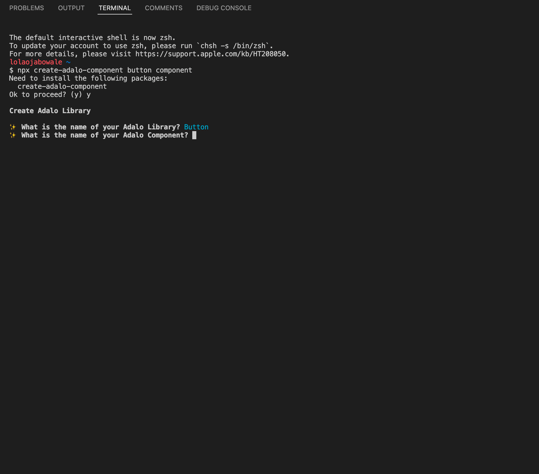
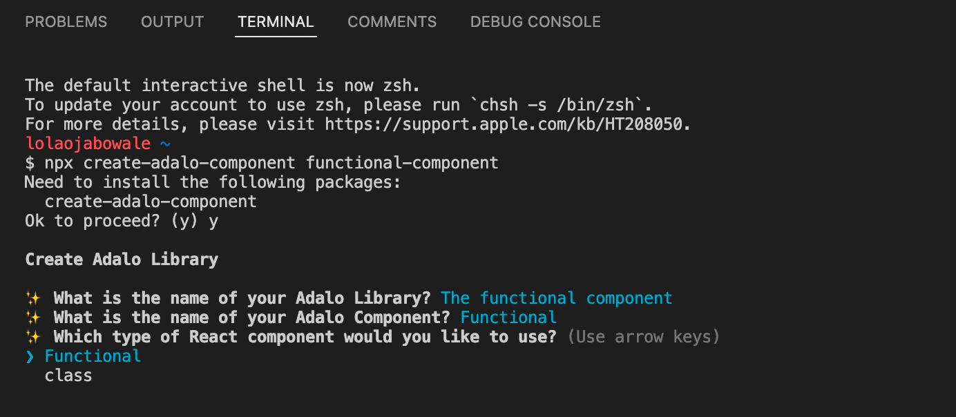
Next, you’ll be asked to choose between a functional and class component. Both options are suitable for Adalo component development, so you can pick the one that aligns with your personal preference.
When you run
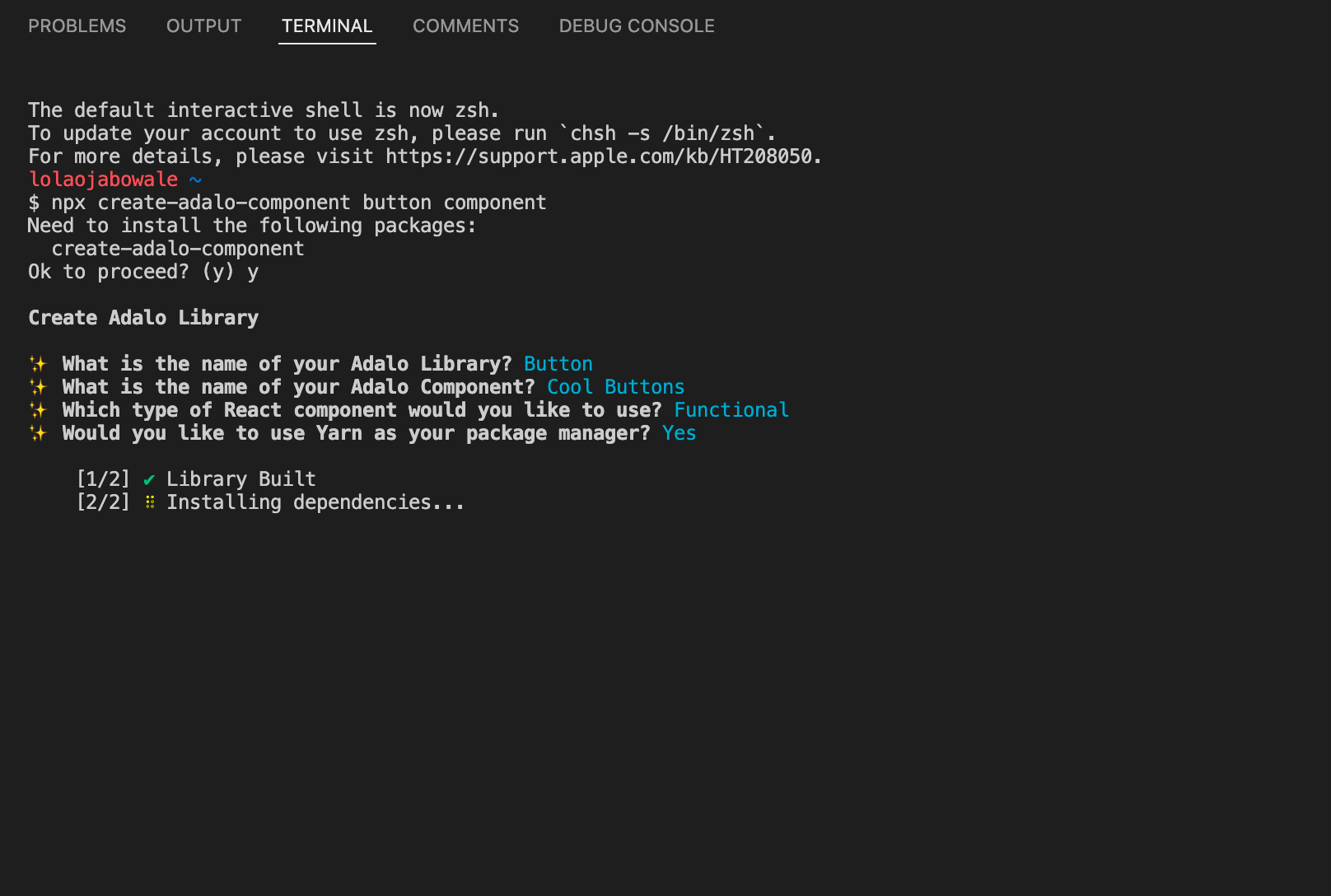
npx create-adalo-component, you'll be asked whether you'd like to use a package manager. Your choice here will determine the commands you use to manage your component.
- If you opt for the package manager, your commands will begin with
yarn, such asyarn adalo startandyarn adalo login.
- If you choose not to use the package manager, your commands will start with
npx, likenpx adalo startandnpx adalo login.
Adalo library structure
For each component you develop, you'll create a separate folder within the library you've set up. Here's an example of what the structure looks like:
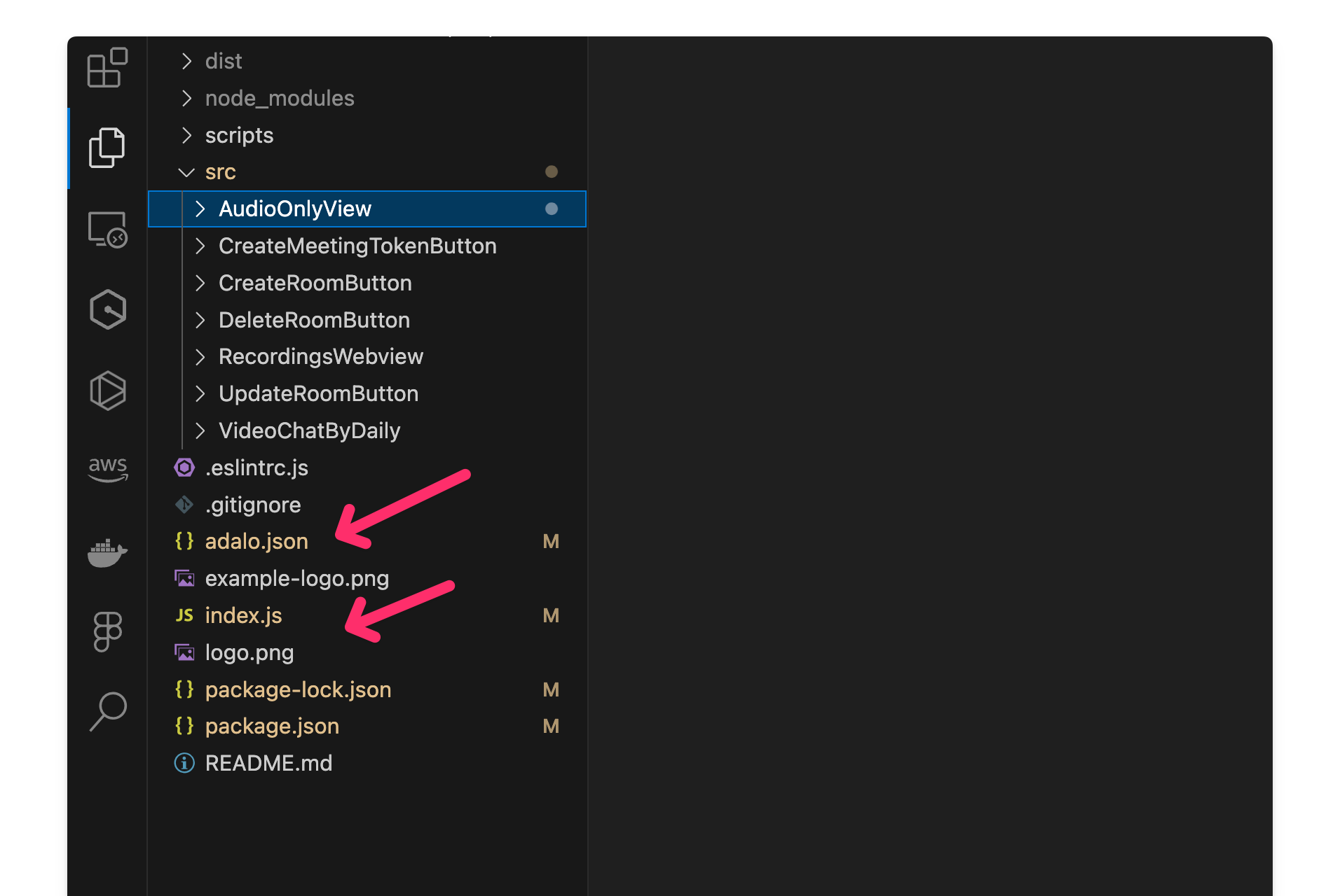
You can add multiple components by creating additional folders within your library directory. Be sure to update both the
adalo.json and the index.js to include these new components.Adalo component structure
When working on a specific component, the majority of your development time will be spent in the
manifest.json and index.js files. These files are crucial for defining the component's behavior and appearance within the Adalo environment.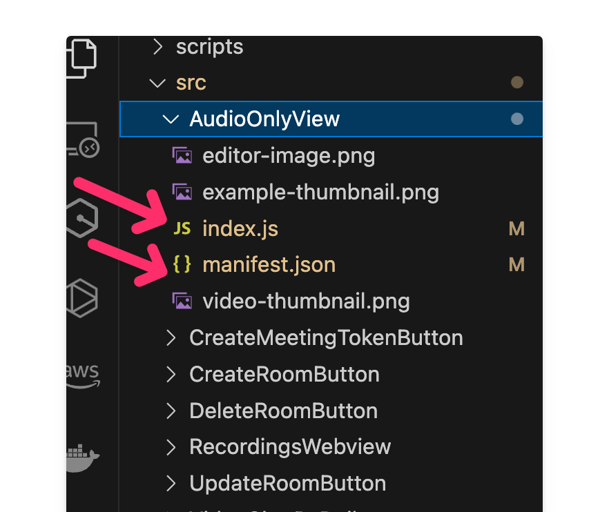
Manifest.json
The
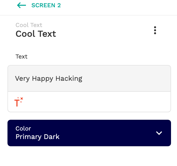
manifest.json file is essential for configuring your component within Adalo's editor. Adalo uses this file to generate the settings displayed on the left panel in the editor, and each property defined in the manifest.json is passed down to your component as a React prop. Here's an example of a
manifest.json configuration and how it appears in the Adalo environment. You can find more details about the manifest.json file in Adalo's developer documentation.{
"displayName": "Cool Text",
"defaultWidth": 160,
"defaultHeight": 24,
"components": "./index.js",
"icon": "./example-thumbnail.png",
"props": [
{
"name": "text",
"displayName": "Text",
"type": "text",
"default": "Happy Hacking"
},
{
"name": "color",
"displayName": "Color",
"type": "color",
"default": "#00A898"
}
]
}
Index.js
In the
index.js file, your component comes to life and becomes functional. Any adjustments you make in the manifest.json file are reflected in your index.js code. For instance, in the example below, the index.js file renders text, and in our manifest.json, we have a color prop. Changing the color prop in the manifest will result in changes to the text displayed in the component.import React from 'react';
function MyAdaloComponent(props) {
const { color, text } = props;
return (
<div style={{ color: color }}>
{text}
</div>
);
}
export default MyAdaloComponent;
Modifying the component UI and adding elements
To add elements to your components, you can create them directly in the
index.js file and ensure they are referenced in the return section of the component. Here's a screenshot example: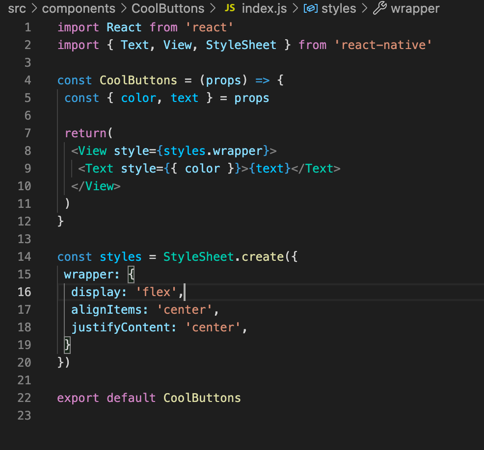
Adding Actions
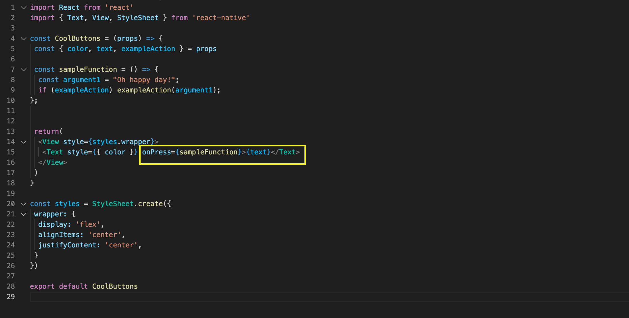
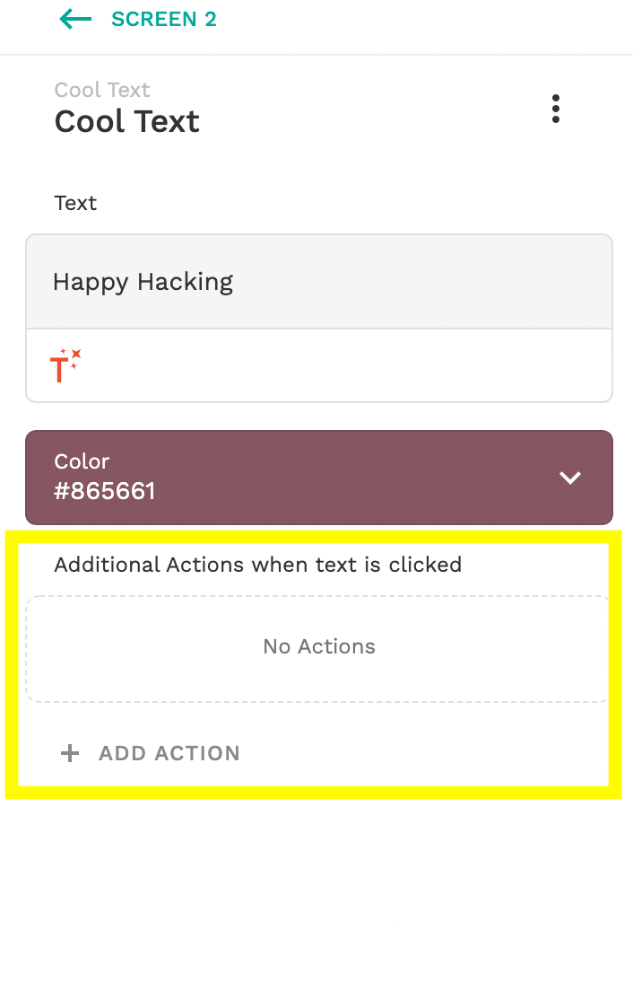
Adding actions to elements allows users to configure subsequent actions in Adalo. These actions appear in the properties editor, and you can define where they should occur in your code.
For instance, in this example, I've set up actions to occur after clicking the text element
Routing Data from your component to Adalo
If you need to share data from your component with Adalo, perhaps for users to save information for later use, you can achieve this by creating arguments. These arguments can be used in your functions when you call them, allowing users to utilize data from your components.
For instance, in my example, I've created an exampleAction with a single argument of type text. In my component's index.js, I provide the argument with the value "text." This allows for data to flow from the component to Adalo, enhancing its functionality.

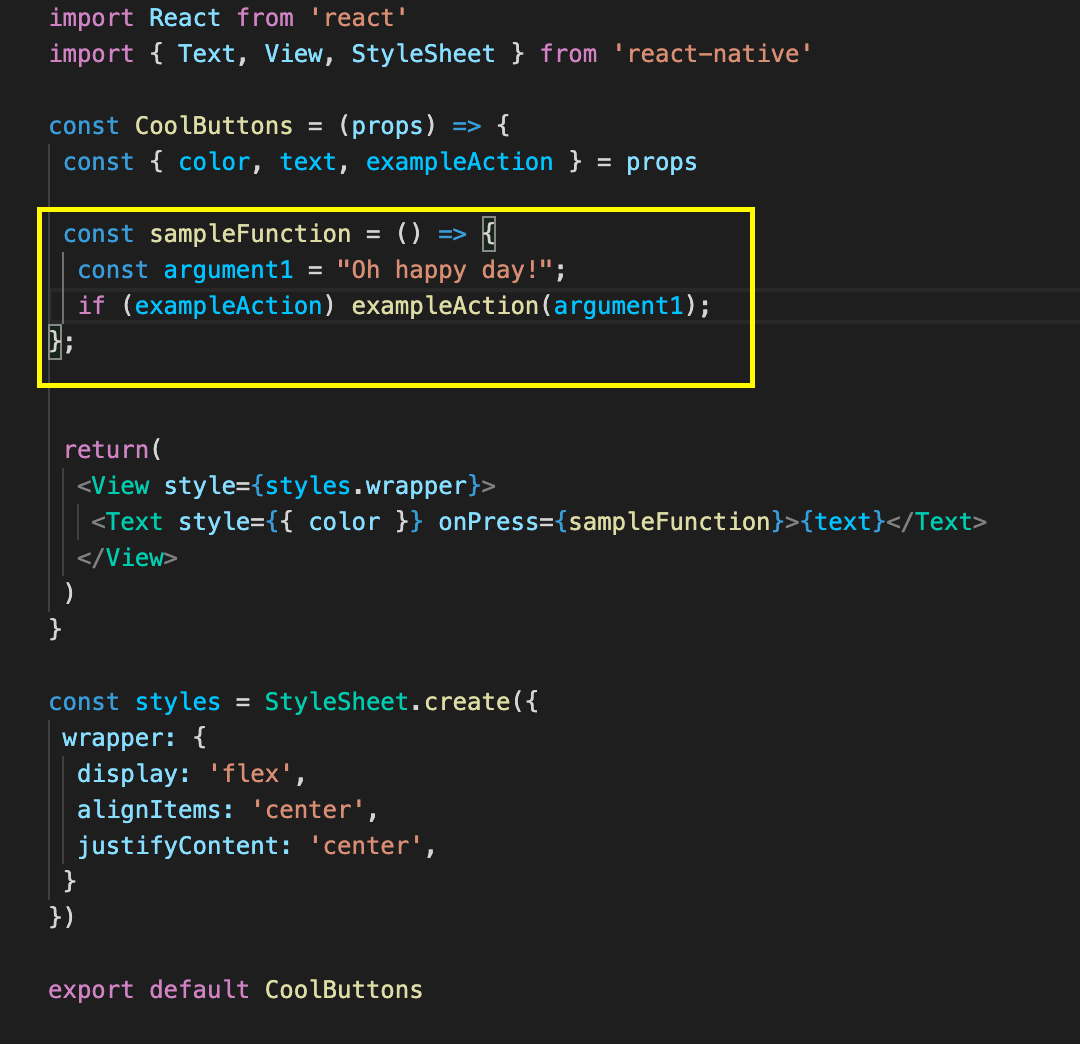
In the properties editor, you can now access the data and save it in a data collection or perform other actions as needed. For more detailed information on this topic, you can refer to this source. It provides valuable insights into using arguments as magic text in Adalo components.
Tips for Building Components
Here are some useful tips and tricks to enhance your component-building experience:
1. Conditional Element Display
- You can conditionally show and hide elements within your component, which is particularly helpful when dealing with multiple elements.
2. Customizing Component Rendering
- Consider rendering elements differently in the editor to optimize their display for preview or live app usage.
3. Embrace Material Design
- Adalo follows a material design system, so adhering to these design standards ensures your components seamlessly integrate with the broader Adalo ecosystem.
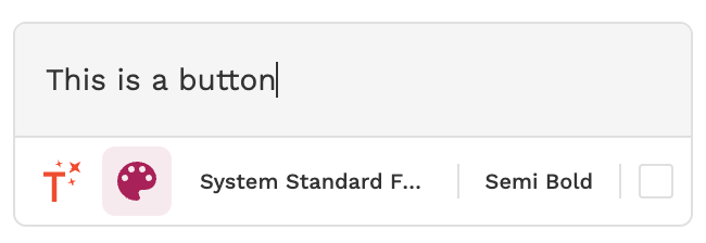
4. Using Style Prop
- Utilize the style picker when defining props for text elements. It offers convenience by allowing you to access various styles easily without defining each prop individually. Here's an example:
"name": "createText",
"displayName": "Button text",
"type": "text",
"default": "Create room",
"helpText": "The text that displays on the button",
"enabled": {
  "editCreateRoomButton": true
},
"styles": {
  "fontFamily": "@body",
  "fontWeight": 600,
  "color": "@contrast:createBackgroundColor"
}
Access it when rendering the element like this:
component.styles.prop

// Example:
createRoomButton.styles.createText
Using the style argument eliminates the need to define a specific prop for each style in your component, streamlining the process. This is what it looks like in the editor
Useful Commands
Here are some essential commands to remember when working with your Adalo component:
Login to Your Adalo Account:
adalo login
Start the Development Server:
adalo dev
Publish Your Component:
adalo publish
Update Your Component's Listing:
Use these commands based on your choice of package manager (yarn or npx) when creating the component.
adalo update
Additional Resources
Explore these resources to enhance your knowledge of creating components with Adalo:
- Adalo Developer Documentation: A comprehensive guide to component development.
- AdaloHQ GitHub: Browse examples and find help with syntax.
- Adalo Community Forum: Engage with the Adalo community and discuss components.
Feel free to reach out if you have any questions or need assistance with Adalo component development. Happy to chat anytime!
.png?table=block&id=9ba33ac6-8e12-48f6-b980-4333b612ec56&cache=v2)
