.png?table=block&id=d258184f-72f6-44ad-a2a5-e33f44fda1e1&cache=v2)
Do not index
In this tutorial, we’ll create a TalkJS component for Adalo. TalkJS is a chat API that comes with a prebuilt UI interface and Adalo is a no-code mobile app builder with a marketplace of components from third-party developers and a large list of component requests from the community.
If you’re curious about the end-to-end process of building components for the Adalo ecosystem, this is your guide and for a visual walkthrough watch the youtube video.
What we’ll build
We're creating a component using TalkJS's inbox UI that lets users message each other directly. It will include these features:

- Setting up users and participants in the Adalo editor.
- Seeing past conversations.
- Sending messages directly.
- Moving between inbox and chat view.
This guide details building the component step by step. To skip ahead to the finished version, see the repository here.
Prerequisites
Before we begin building, ensure you have:
- A free Adalo account with developer mode on.
- Your preferred IDE (I use Visual Studio Code).
- Node.js version
>=10.2.
- A TalkJS account (free and unlimited during development).
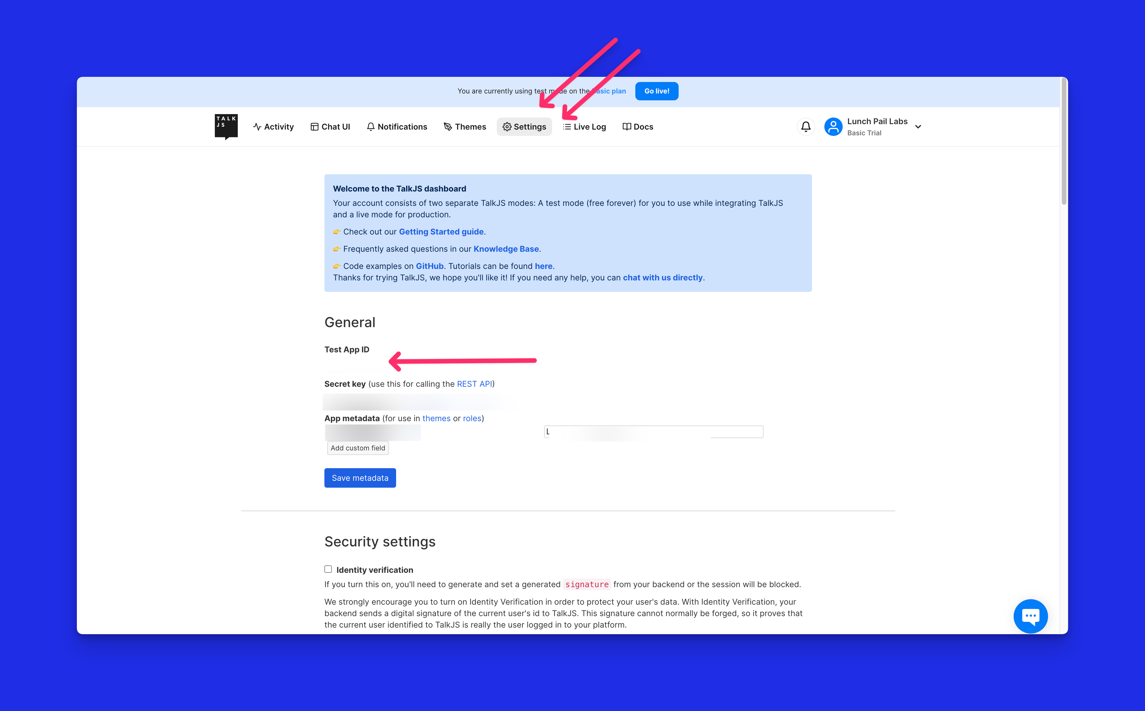
- You can find your TalkJS appID by signing into your TalkJS account and navigating to the settings tab in your dashboard, where the APP ID is listed.
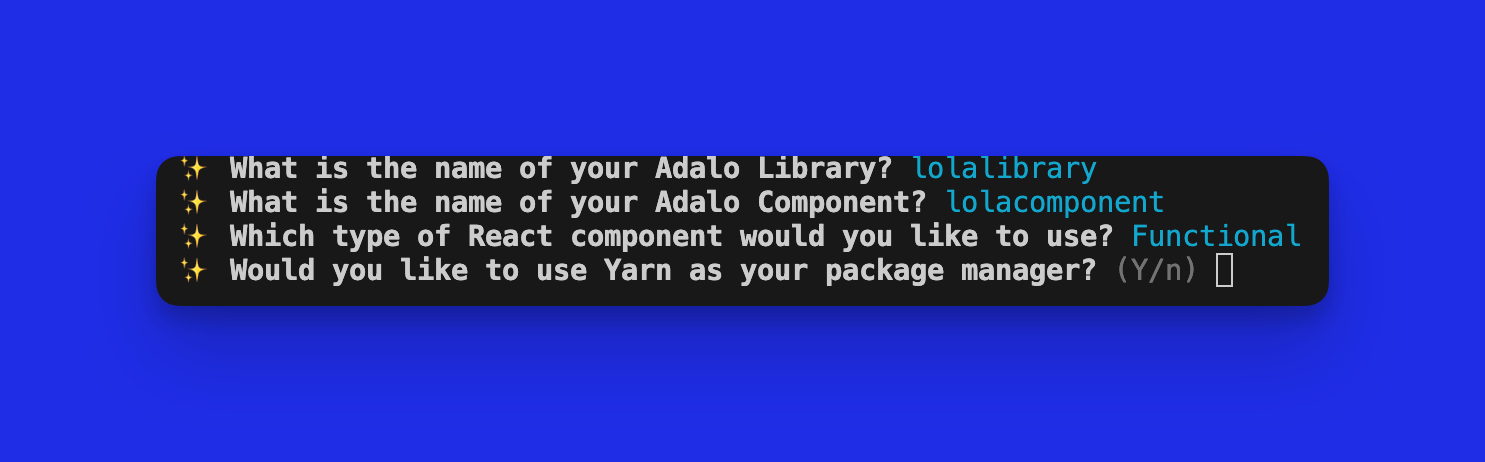
1. Create a new Adalo library
To begin, create a new Adalo library using the
create-adalo-component command in your terminal. This command sets up the environment for custom Adalo components, installs dependencies, adds scripts and provides a basic starter manifest.json and component. Make sure to replace chat-component with your desired library name.npx create-adalo-component chat-componentProceed with the prompts to name the component. For this tutorial, I’m selecting a functional component and not using Yarn as the package manager.
If you need more help with component setup, visit this tutorial which also includes a video!
Now that your component is set up, you can access it and proceed to the next step by running the following command. Replace
chat-component with whatever you named your folder.cd chat-component
Currently, Adalo's initialization tool might not set up the preferred versions of React and React Native. To ensure compatibility with Adalo's environment, modify your
package.json to include peerDependencies for React and React Native, and update devDependencies with the latest Adalo CLI version, as illustrated here:"peerDependencies": {
"react": "18.2.0",
"react-native": "0.72.5"
},
"devDependencies": {
"@adalo/cli": "^0.0.59"
}Run
npm install to have all dependencies installed
In the next section, we’ll configure the manifest.json.2. Configure the manifest.json
Each component includes a manifest.json file, which outlines the properties the component can accept and which controls should be displayed in the Adalo editor.

You can refer to Adalo's documentation to learn more about the manifest.json file and various types of props here.
Our chat component requires key inputs: TalkJS Application ID, UserID, and participant details for conversations. We've selected essential fields for users and participants; for a full range of available fields, consult the TalkJS documentation.
The table below summarizes these inputs and the complete manifest.json file.
Prop name | Description | Type |
talkJsApplicationID | The TalkJS application ID. | text |
userId | The ID of the user joining the conversation. | text |
name | Display the name of the participant. | text |
email | Email address of the user. | text |
photo | User's photo. | image |
chatView | Toggle to enable participants. | boolean |
pUserId | Participant's user ID. Only enabled when chatView is true. | text |
pName | Participant's name. Only enabled when chatView is true. | text |
pPhoto | Participant's photo. Only enabled when chatView is true. | text |
pEmail | Participant's email. Only enabled when chatView is true. | text |
And this is the full manifest.json code for the section
{
  "displayName": "TalkJS Chat demo",
  "defaultWidth": 500,
  "defaultHeight": 600,
  "resizeY": true,
  "resizeX": true,
  "components": "./index.js",
  "icon": "./ChatThumbnail.png",
  "props": [
    {
      "name": "talkJsApplicationID",
      "displayName": "appID",
      "type": "text",
      "helpText": "The talkJS app ID"
    },
    {
      "name": "userId",
      "displayName": "ID",
      "type": "text",
      "helpText": "The id of the user joining this conversation"
    },
    {
      "name": "name",
      "displayName": "Name",
      "type": "text",
      "helpText": "The display name for the participant in the conversation"
    },
    {
      "name": "photo",
      "displayName": "Photo",
      "type": "image",
      "helpText": "The optional user image for the call"
    },
    {
      "name": "email",
      "displayName": "Email",
      "type": "text",
      "helpText": "The user's email"
    },
    {
      "name": "chatView",
      "displayName": "Start in chat",
      "type": "boolean",
      "helpText": "Starts in chat view; add a participant if enabled"
    },
    {
      "name": "pUserId",
      "displayName": "ID",
      "type": "text",
      "helpText": "The id of the user joining this conversation",
      "enabled": {
        "chatView": true
      }
    },
    {
      "name": "pName",
      "displayName": "Name",
      "type": "text",
      "helpText": "The display name for the participant in the conversation",
      "enabled": {
        "chatView": true
      }
    },
    {
      "name": "pPhoto",
      "displayName": "Photo",
      "type": "image",
      "helpText": "The optional user image for the call",
      "enabled": {
        "chatView": true
      }
    },
    {
      "name": "pEmail",
      "displayName": "Email",
      "type": "text",
      "helpText": "The user's email",
      "enabled": {
        "chatView": true
      }
    }
  ]
}
3. The component’s entry point
When we used
create adalo component, Adalo gave us an index.js template. The index.js is where we define our component's code and logic. We're building a cross-platform component for iOS, Android, and web, so some parts of our code will only be for mobile and others are for the web.
Let's start with the reusable pieces in our index.js.
First, install the required dependencies. Then, copy the
editorImage from the demo repository to your src folder, ensuring the file name and path match your project's structure. Later, we'll use this editorImage whenever the user is in Adalo's editor.import React, { useState, useEffect } from "react";
import { View, Image, StyleSheet, ActivityIndicator } from "react-native";
import editorImage from "./EditorImage.png";Then, destructure the props object. We include certain additional props provided by Adalo, which don’t need to be defined in our manifest.
These include 'editor' to determine the user's status within the editor, and '_height' to retrieve the height of the component within the editor.
const ChatView = (props) => {
  const {
    editor,
    talkJsApplicationID,
    userId,
    name,
    email,
    photo,
    pName,
    pUserId,
    pEmail,
    pPhoto,
    _height,
    chatView
  } = props;
Next, we initialize two pieces of state using React's
useState hook: me and other. These states will be used to store information about the users involved in the conversation.const [me, setMe] = useState(null);
const [other, setOther] = useState(null);To create a user or participant in TalkJS, we require a
userID and a name. Additionally, for photos, TalkJS expects a URL. In Adalo, the URL of an image can be found in the image.uri property of the image object. Since our images are photo and pPhoto, we'll use photo.uri and pPhoto.uri respectively.
Two
useEffect hooks update the me and other states and set their values, including the photo URL, when available.useEffect(() => {
if (userId && name) {
setMe({
id: userId,
name: name,
email: email,
photoUrl: photo?.uri,
});
}
}, [userId, name, email]);
useEffect(() => {
if (pUserId && pName) {
setOther({
id: pUserId,
name: pName,
email: pEmail,
photoUrl: pPhoto?.uri,
});
}
}, [pUserId, pName, pEmail, pPhoto]);The
return section of the component is responsible for rendering different UI elements based on certain conditions:- If the
editorprop istrue, it displays an editor image.
- If the
mestate is not set or thechatViewis enabled and theotherstate is not set, it displays an activity indicator.
- Otherwise, it would render a
ConversationUIcomponent with the appropriate user information. However, for now, we'll have it returnnull, and we'll expand on this in the next section.
return (
  <>
    {editor ? (
      <Image
        source={editorImage}
        style={{
          flex: 1,
          height: _height,
          justifyContent: "center",
          alignItems: "center",
        }}
      />
    ) : !me || (chatView && !other) ? (
      <View style={{ height: _height, flex: 1, justifyContent: 'center', alignItems: 'center' }}>
        <ActivityIndicator size="large" color="#242526" />
      </View>
    ) : null}
  </>
);

export default ChatView;
Finally, the ChatView component is exported as the default export of this module.
4. The web version of the chat component
Create a
ConversationUI folder for mobile and web versions. Add index.web.js for the web component, which will display the inbox and support one-on-one chats.We start by importing the necessary dependencies, including React, React Native components, and TalkJS.
import React, { useCallback } from "react";
import { View, ActivityIndicator } from "react-native";
import Talk from "talkjs";
import { Session, Inbox } from "@talkjs/react";
Don’t forget to install TalkJS with
npm install talkjs @talkjs/reactThen define the ConversationUI component and define the props
const ConversationUI = ({
  me,
  other,
  ID,
  chatView,
  _height,
}) => {
  // ...
}
Use the
useCallback hook to create a function called syncUser that synchronizes the local user with TalkJS.const syncUser = useCallback(() => new Talk.User(me), []);Next the
syncConversation function synchronizes the conversation between the local user and the other participant. It creates a conversation, sets participants, and returns the conversation object.const syncConversation = useCallback(
(session) => {
const otherUser = new Talk.User(other);
const conversation = session.getOrCreateConversation(Talk.oneOnOneId(me.id, other.id));
conversation.setParticipant(session.me);
conversation.setParticipant(otherUser);
return conversation;
},
[]
);We define the props for the
Inbox component, which includes styling, loading indicators, and optionally, the syncConversation function based on the chatView flag.const inboxProps = {
style: { width: "100%", height: _height },
className: "chat-container",
loadingComponent: (
<View style={{ height: _height, flex: 1, justifyContent: 'center', alignItems: 'center' }}>
<ActivityIndicator size="large" color="#242526" />
</View>
),
...(chatView && { syncConversation }),
};Finally, we render the chat interface using the TalkJS components within a
Session. We provide the appId and syncUser function, and pass the inboxProps to the Inbox.return (
<View>
<Session appId={ID} syncUser={syncUser}>
<Inbox {...inboxProps} />
</Session>
</View>
);and export the ConversationUI
export default ConversationUI;Next up we’ll configure the native version of this module
5. The mobile version of the chat component
For the mobile version of our chat component, we'll set up an `
index.js` file in the /ConversationUI folder,
TalkJs's React Native SDK uses two components for the inbox view: Chatbox and ConversationList. In our setup,
chatView true displays the Chatbox, while false shows the ConversationList.Install dependencies
Import necessary modules from React and React Native, along with the TalkJS package:
import React, { useState, useEffect } from 'react';
import { View, ActivityIndicator } from 'react-native';
import * as TalkRn from '@talkjs/react-native';
Then, execute the following command in your terminal to install TalkJS and associated dependencies:
npm install --save @talkjs/react-native @notifee/react-native @react-native-community/push-notification-ios @react-native-firebase/app @react-native-firebase/messaging react-native-webviewIncorporate a header for mobile consistency
To maintain consistency with the web version, let's integrate a header into the mobile component for seamless navigation back to the conversational UI.
Begin by crafting a new file
InboxHeader.js in the ConversationUI folder and insert the code below:import React from "react";
import { View, Text, StyleSheet, TouchableOpacity } from "react-native";
import ChevronLeft from "./icons/ChevronLeft";
const Header = ({ onBackPress}) => {
return (
<TouchableOpacity
onPress={onBackPress}
style={[styles.header]}
>
<View style={styles.backButton}>
<ChevronLeft width="16" height="16" color="gray" />
<Text style={[styles.title]}>Inbox</Text>
</View>
</TouchableOpacity>
);
};
const styles = StyleSheet.create({
header: {
flexDirection: "row",
alignItems: "center",
paddingVertical: 16,
paddingHorizontal: 16,
marginBottom: 8,
borderRadius: 8,
borderWidth: 1,
borderColor: "#ddd",
backgroundColor: "#fff",
},
backButton: {
flexDirection: "row",
alignItems: "center",
marginRight: 8,
},
title: {
fontSize: 14,
color: "black",
},
});
export default Header;Next, we'll incorporate a ChevronLeft component to serve as a back icon. Create a new /icons directory inside the ConversationUI folder and add the following ChevronLeft component code:
import React from 'react';
import Svg, {Path} from 'react-native-svg';

const ChevronLeft = ({
  width = 16,
  height = 16,
  color = 'currentColor',
  strokeWidth = 1,
}) => {
  return (
    <Svg width={width} height={height} viewBox="0 0 16 16" fill="none">
      <Path
        fill-rule="evenodd"
        d="M11.354 1.646a.5.5 0 0 1 0 .708L5.707 8l5.647 5.646a.5.5 0 0 1-.708.708l-6-6a.5.5 0 0 1 0-.708l6-6a.5.5 0 0 1 .708 0"
        fill={color}
        stroke={color}
        strokeWidth={strokeWidth}
      />
    </Svg>
  );
};

export default ChevronLeft;
To complete the setup, import the
Header component into your index.js file located in the ConversationUI directory.import Header from './InboxHeader';Build the ConversationUI component
Define the
ConversationUI component that receives props like me, other, ID, _height, and chatView:const ConversationUI = ({
me,
other,
ID,
_height,
chatView,
}) => {Create state variables to manage the conversation builder and whether to show the conversation list:
const [conversationBuilder, setConversationBuilder] = useState(null);
const [showConversationList, setShowConversationList] = useState(null);
Use the
useEffect hook to handle the initialization based on the chatView prop:useEffect(() => {
if (!chatView) {
setShowConversationList(true);
} else {
const builder = TalkRn.getConversationBuilder(TalkRn.oneOnOneId(me.id, other.id));
builder.setParticipant(me);
builder.setParticipant(other);
setConversationBuilder(builder);
}
}, [me, other]);Implement the
onSelectConversation function to handle conversation selection and create an onBackPress function to go back to the conversation list:const onSelectConversation = event => {
setConversationBuilder(event.conversation);
};
const onBackPress = () => {
setShowConversationList(true);
};Render the component within a
TalkRn.Session and export the ConversationUI component as the default export.return (
<>
<TalkRn.Session appId={ID} me={me}>
<View style={{ height: _height }}>
{showConversationList ? (
// Display the ConversationList when showConversationList is true.
<TalkRn.ConversationList
onSelectConversation={onSelectConversation}
loadingComponent={
<View style={{ height: _height, flex: 1, justifyContent: 'center', alignItems: 'center' }}>
<ActivityIndicator size="large" color="#242526" />
</View>
}
/>
) : (
// Display the Chatbox when showConversationList is false and conversationBuilder is available.
conversationBuilder && (
<>
<Header onBackPress={onBackPress} />
<TalkRn.Chatbox
conversationBuilder={conversationBuilder}
loadingComponent={
<View style={{ height: _height, flex: 1, justifyContent: 'center', alignItems: 'center' }}>
<ActivityIndicator size="large" color="#242526" />
</View>
}
/>
</>
)
)}
</View>
</TalkRn.Session>
</>
);
};
export default ConversationUI;6. Finish up the main component
With both conversational UI components complete, import them into our main component:
import ConversationUI from "./ConversationUI";
Update the return section to return the Conversation UI component as follows
return (
    <>
      {editor ? (
        <Image
          source={editorImage}
          style={{
            flex: 1,
            height: _height,
            justifyContent: "center",
            alignItems: "center",
            backgroundColor: "red",
          }}
        />
      ) : !me || (chatView && !other) ? (
        <View style={{ height: _height, flex: 1, justifyContent: 'center', alignItems: 'center' }}>
          <ActivityIndicator size="large" color="#242526" />
        </View>
      ) : (
        <ConversationUI
          me={me}
          other={other}
          ID={talkJsApplicationID}
          _height={_height}
          chatView={chatView}
        />
      )}
    </>
  );

};
7. Add install scripts
Our component needs install scripts to function on physical devices. These scripts allow for modifications wherever the component is deployed
Our scripts will target key modifications:
- Update the
compileSdkVersionin the build.gradle file, following TalkJS's troubleshooting tips.
- Adjust the android.work version to align with Notifee and Adalo's requirements.
- Incorporate audio permissions for voice chat functionality.
Android install script
Begin by creating a
scripts folder, then add an install_android.sh file inside it. You'll need to script changes to the build.gradle file and configure permissions, drawing inspiration from the example script below.#!/bin/bash
set -e
set -x
rootGradleFile="android/build.gradle"
appGradleFile="android/app/build.gradle"
nl=$'\n'
androidManifestFile="android/app/src/main/AndroidManifest.xml"
# Function to update compileSdkVersion
update_compileSdkVersion() {
sed -i "s/compileSdkVersion = [0-9]*/compileSdkVersion = 34/" "$rootGradleFile"
}
# Function to add resolutionStrategy in the app build.gradle
add_appResolutionStrategy() {
resolutionStrategyLine="configurations.all {\\ \\${nl} resolutionStrategy.force 'androidx.work:work-runtime:2.7.0'\\${nl}}\\${nl}"
# Check if the line already exists
if ! grep -q "resolutionStrategy.force 'androidx.work:work-runtime:2.7.0'" "$appGradleFile"; then
# Insert the resolutionStrategy line after dependencies block
sed -i "/android {/a \\
$resolutionStrategyLine" "$appGradleFile"
fi
}
# Function to add permissions in AndroidManifest.xml
add_permissions() {
# Check if permissions already exist
if ! grep -q "android.permission.MODIFY_AUDIO_SETTINGS" "$androidManifestFile"; then
echo "Adding permissions to AndroidManifest.xml"
sed -i "/android.permission.INTERNET/a\\
<uses-permission android:name=\"android.permission.MODIFY_AUDIO_SETTINGS\"/>\\
<uses-permission android:name=\"android.permission.RECORD_AUDIO\"/>" "$androidManifestFile"
else
echo "Permissions already exist in AndroidManifest.xml"
fi
}
# Update compileSdkVersion
update_compileSdkVersion
# Add resolutionStrategy in the app build.gradle
add_appResolutionStrategy
# Add permissions in AndroidManifest.xml
add_permissions
echo "compileSdkVersion updated in $rootGradleFile"
echo "compileSdkVersion updated in $gradleFile"
echo "Permissions updated in $androidManifestFile"iOS install script
For iOS, introduce an
install_ios.sh file to manage Podfile updates and enable microphone access. Consider this sample script as a reference.#!/bin/bash
set -e
set -x
name=$PROJECT_NAME
podfile="ios/Podfile"
target=$name
infoPlist="ios/$name/Info.plist"
# Function to add a pod entry within the target block if it does not exist
add_pod_to_target() {
if ! grep -q "$1" "$podfile"; then
echo "Adding $1 to target $target in Podfile"
# Use awk to insert the pod lines within the target block
awk -v podline="$1" -v target="$target" '
$0 ~ "target \x27" target "\x27 do" {print; inBlock=1; next}
inBlock && /end/ {print podline; print; inBlock=0; next}
{print}
' "$podfile" > tmpfile && mv tmpfile "$podfile"
else
echo "$1 already in target $target in Podfile"
fi
}
# Enable modular headers for all pods
echo "Enabling modular headers globally in Podfile"
if ! grep -q "use_modular_headers!" "$podfile"; then
sed -i '' '1s/^/use_modular_headers!\n/' "$podfile"
fi
# Modify the podfile within the target
add_pod_to_target " pod 'Firebase', :modular_headers => true"
add_pod_to_target " pod 'FirebaseCore', :modular_headers => true"
add_pod_to_target " pod 'GoogleUtilities', :modular_headers => true"
# Ensure RNFirebaseAsStaticFramework setting is added within the target block
add_pod_to_target "\$RNFirebaseAsStaticFramework = true"
# Check and add microphone usage description in Info.plist
if grep -q "<key>NSMicrophoneUsageDescription</key>" "$infoPlist"; then
echo "Microphone already supported in $infoPlist, nothing to do here."
else
echo "Adding NSMicrophoneUsageDescription to $infoPlist"
plutil -insert NSMicrophoneUsageDescription -string 'Chat needs microphone to record messages' "$infoPlist"
fi
echo "Podfile configured for target $target"
echo "Info.plist configured for microphone support"
Make the scripts executable and adding to the Adalo.json
Next, run the following commands in your project's root directory to make the scripts executable.
chmod +x ./scripts/install_ios.sh
chmod +x ./scripts/install_android.sh
To ensure Adalo recognizes them during publishing, include these scripts in
adalo.json under iosInstallScript and androidInstallScript.{
"displayName": "Chat view",
"components": [
{
"name": "TalkJs",
"manifest": "./src/components/TalkJs/manifest.json"
}
],
"author": "Demo user",
"description": "Add professional chat to your Adalo apps",
"logo": "./example-logo.png",
"requiresThirdPartySubscription": true,
"iosInstallScript": "./scripts/install_ios.sh",
"androidInstallScript": "./scripts/install_android.sh"
}8. Test and publish the component
Before releasing your component, ensure to test and demo it thoroughly. This step is essential, especially if you plan to offer it to others within the Adalo ecosystem through marketplace listing.
Test the component on the web
To test the component, execute
npx adalo dev. This command will list the component under the 'Development' section in any Adalo app you choose for testing.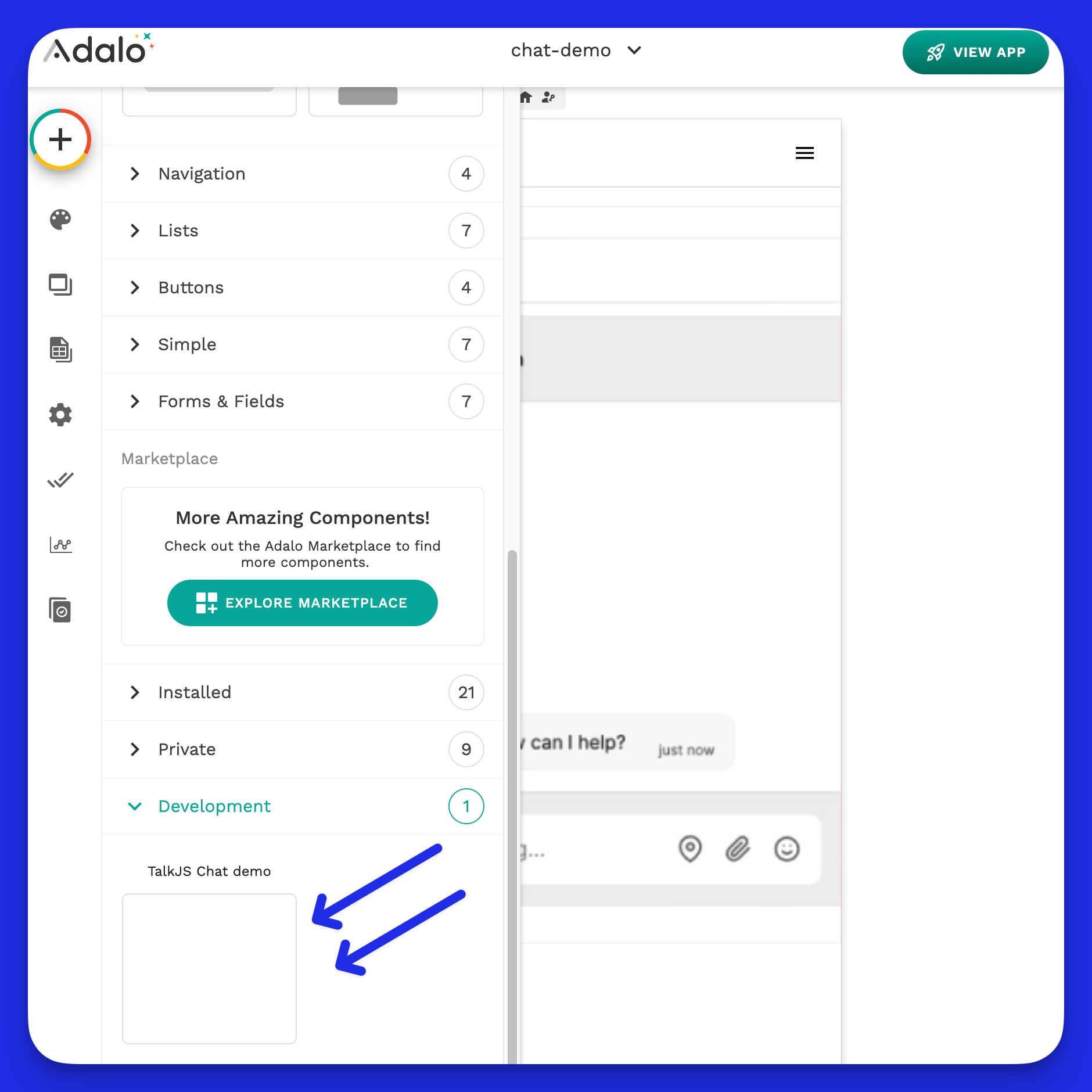
Next, integrate the component into your app and experiment with various configurations by adjusting its properties.

Test the component in a React Native environment
In addition to testing your component post-publication, evaluating it within a React Native setup can help identify potential issues beforehand.
This blog post details the testing process in React Native, offering step-by-step guidance to ensure your component performs optimally, giving you extra assurance before its release.
Publish the component
Before publishing a component verify that your adalo.json file is accurately filled out, especially if you want to list your component publicly in Adalo’s marketplace.
To publish your component, execute
npx adalo publish in your terminal. Currently, your Node version must be ≥ 10.2 and ≤ 16.15 for the command to function correctly.
If you encounter an error while publishing, changing your Node version with nvm use <node version> could fix the problem.
Conclusion
That concludes our guide! We've crafted a cross-platform component for Adalo, laying the groundwork for further exploration in component development. You can consider enhancing this foundation by:
- Integrating group chat capabilities
- Implementing notifications
- Introducing additional views, such as a popup widget
Should you experiment with these extensions, I'd love to hear about it. Reach out at hey@lunchpaillabs.com.
.png?table=block&id=9ba33ac6-8e12-48f6-b980-4333b612ec56&cache=v2)